Source Code Metrics Reports
Overview
Metrics Report
Objects of Observation
Metrics Context
Metrics Report Construction Mode
Types of Metrics Reports by Value
Types of Metrics Reports by Presentation
Working with Metrics Reports
Source Code Metrics Template File
Overview
The metrics user interface is organized around metrics reports in which it is possible to display property values in various ways. To achieve greater flexibility, the metrics report is logically distinct from metrics data, similar to the way data organized in a table can be portrayed graphically in the form of many different charts.
In this sense, the process of attaching graphics representations (metrics reports) to a group of metrics data is called applying a metrics report to a particular group of metrics data.
Separating the data from the visual representation offers three important possibilities:
1. In a metrics report (which, for example, portrays a group of Halstead Parameters), it is possible to display various objects of observation (different modules, functions, and so on).
2. Different metrics reports (with different groups of metrics, different types of charts, differently presented information, and so on) can be applied to the same objects of observation (for example, the
main()function).3. It is possible to, over a single project, create a group of metrics reports which provides a complete overview of the project, and then to apply these reports to other projects, either in order to compare projects, or due to interest in a precisely specified group of metrics for each project.
Metrics Report
The main goal of introducing Source Code Metrics in DA-C was enabling you to ascertain software quality, according to project-defined criteria, with a single glance at a report.
Every metrics report is displayed in its own window, which is on a par with Graph, Editor, Browser, and all other windows in DA-C.
Figure shows a typical metrics report. Settings pertaining to the metrics context (the way in which metrics are displayed, see section "Metrics Context") are displayed in the left pane of the report, while metrics data from several selected C modules is displayed in the right pane.
The form in which a metrics report is typically displayed.
The selected objects of observation are a group of several modules from the same project folder.
The values of the parameter Comment Lines are displayed on module level, that is, the relative number of clear comment lines in each of the displayed modules. The data appears in the form of a Bar chart, and the manner of presentation is "Simple" — the real values of parameters obtained by metrics analysis are displayed. The enumerated features together form the metrics context and determine which metrics will be displayed and in which manner.
Therefore, to obtain the desired metrics report, objects of observation must be determined and the metrics context of the report must be set.

Objects of Observation
Before metrics reports can appear, it is necessary to select the desired objects of observation. By means of this procedure, you determine the group of objects for which you would like to view property values.
One of the following items can be selected as an object of observation:
Function,
Group of functions,
Module,
Logical group of modules,
Group of modules of your choice.
If you do not select an object of observation, the metrics reports will be empty.
To select an object of observation, do one of the following:
Right-click an object in DA-C, and then select the Metrics command in the shortcut menu.or
Select or position the insertion point on the desired object or in the desired window and, on the main menu, start the Metrics / Apply command.Following table gives a detailed description of the ways in which you can select an object of observation from various DA-C windows. The table does not show this, but it is understood that a right-click opens the shortcut menu, on which you should click Metrics; if you prefer making a selection by placing the insertion point on the object of your choice to using the shortcut menu, use the Metrics > Apply command instead.
After you have selected an object of observation in one of the ways enumerated, all existing metrics reports will display the newly-selected object of observation, as will all reports created from this point on. If there is no existing report, a new report will be created.
A selected object of observation will be saved until a new selection is made. On closing the project, the object of observation is saved in the Session File; in the next session, you can continue working exactly where you left off.
Table 6: Manner of selection of particular objects from various DA-C windows
DA-C window
Object
Manner of selection
Editor
function
right-click or position the insertion point on the name of the function
module
position the insertion point in the Editor
Browser
function
right-click or position the insertion point on the name of the function
Flowchart
module
click anywhere in Flowchart (don’t select anything)
Graph
function
right-click or click the function node
group of functions
right-click or select a group of functions
Project
Windowfunction
right-click or select the name of the function in Logical View
module
right-click or select a module
group of modules
right-click or select a folder
project
right-click or select a Project Root directory
Messages
function
select a message (error or warning)
module
select a message (error or warning)
Metrics report
function
select the name of the function or the attached parameter value
module
select the name of the module or the attached parameter value
Metrics Context
The metrics context is a mode of displaying metrics, both in terms of graphics and manner of presentation. The metrics context is fully determined by choice of:
The level of viewing metrics data,
The type of metrics report,
The type of metrics parameter,
The manner in which property values are visualized.
The metrics context is a frame, independent of the metrics data you want to display. Applying the metrics context to specific objects of observation creates a complete metrics report. In this way, the metrics data you want to examine is distinct from the manner of their representation and visual presentation. This gives you the possibility of always viewing various metrics data in the same way.
Levels of Observation
The level of observation determines the scope of the metrics which are to be displayed.
It is possible to choose between the following levels of observation:
Function level,
Module level,
Group of modules level.
Which group of metrics values is to be displayed in metrics reports depends not only on the object of observation, but also on the level of observation, as shown in following table. You should keep this in mind, otherwise unexpected parameters will appear in a metrics report, with what will at first appear to be no discernible reason.
Table 7: The contents of metrics reports, depending on selected levels of observation and objects of observation
Level of observation
Group of modules
Module
Function
Object of observation
function
function module
function module
function
group of functions
function modules from the group
function modules from the group
group of functions
module
module
module
all module functions
group of modules or project
group of modules
group of modules
all functions of a group of modules
For example, if the object of observation you have selected is a group of functions, and the level of observation you have selected is module level, the metrics of modules containing functions from the selected group will be displayed in the metrics report.
Types of Metrics Reports
The choice of one of the metrics report types determines the manner in which the metrics data collected will be presented.
Metrics data can be interpreted from various standpoints. For example, the data item stating "there are 200 comment lines in the program" contains a lot less information than does the data item stating "comment lines make up 12% of the program", or a data item concerning the distribution of comment lines between modules in the program. As a result, the following types of metrics reports have been developed:
Report on ordinary parameter values - Simple or multiple report.
Report on normalized parameter values - Cross parameter report.
Report on distribution of parameter values - Distribution report.
Report on average parameter values - Average report.
All enumerated types of metrics reports are described in detail in section "Types of Metrics Reports".
Types of metrics
In order to obtain the information which interests you in a metrics report, it is necessary to select the corresponding metrics. Each metrics parameter represents an item of information on one of the quantitative attributes of the source code.
Each metrics parameter has a name unique within its group (level of observation). Each metrics parameter is expressed in corresponding units. Parameters such as Lines or Statements appear as absolute numbers of lines of code or commands in the code, while parameters such as Comment Lines or Executable Statements appear in percentual form, relative to the total number of lines of code or commands in the code.
A complete list of metrics has been provided in section "metrics in DA-C".
Ways of Visualizing property values
property values and their interrelations can be observed by means of several types of graphics views. Each of these views allows the possibility of differently experiencing and interpreting parameter values.
The following types of charts are available for the visualization of property values:
Bar chart,
Column chart,
Pie chart,
Radar chart,
Table.
Each of these charts has its own advantages. A table is very practical for detailed comparison and an accurate overview of parameter values. Bar and Column charts are the standard for graphics display of larger sequences of data. A Pie chart is highly suitable for an overview of parameter distribution, and a Radar chart for simultaneous observation of larger numbers of values grouped in larger numbers of series.
Metrics Report Construction Mode
The metrics report Construction Mode is used during report preparation to choose the desired type of parameter and to choose the parameters themselves, as well as to choose the type of report (choice of chart). In Construction Mode, the left pane of the metrics report is a construction dialog box containing options for setting the metrics context of the report. The metrics report is initially displayed in Construction Mode to allow the metrics context to be set.
A metrics report in Construction Mode is displayed in following figure.
Three groups of options are discernible:
Parameters. Enables you to select the level of observation - the scope of metrics (group, module, function), and then to select the parameters themselves from the list
Report. Enables you to select the type of metrics report.
Chart. Enables you to select the chart in the form of which the metrics data will appear (manner of visualization).
A metrics report in Construction Mode
Once the metrics context has been set, it is possible to turn off the Construction Mode; the construction dialog will disappear from the report and the metrics report will take up the entire window area.
metrics on the list have been sorted according to alphabetical order. For Cross parameter and Average report types, it is possible to select more than one parameter from the list, whereas for Simple and Distribution report types, only one parameter from the list can be selected. If no parameter has been selected, an empty metrics report will appear.
Only Simple and Cross parameter types of report are possible for the "Group" level of observation. Selecting the "Group" type of metrics parameter will cause the type of metrics report to be changed to Simple, if another type of metrics report was previously chosen.
Changing the type of report does not change the list of selected parameters, unless the change demands a transition from a single parameter type of report to a type of report with more than one parameter and vice versa (for example, from the Simple to the Average type). In this case, the previous parameter configuration is saved and restored should you revert to the original choice.
Changing the type of chart has no influence on the other elements of the construction dialog box.
Types of Metrics Reports by Value
The following sections describe individual types of metrics reports. The choice of metrics report can be made in the Construction Mode of the metrics report, in the Report list.
Ordinary (Simple and Multiple Report)
Normalized (Cross Parameter Report)
Distributed
Averages
Ordinary (Simple and Multiple Report)You can use Ordinary reports to view the values of a single or multiple metrics parameter for a group of objects of observation.
You can select a single parameter to view in the report. The independent values of the single series in the report are the elements of observation (particular functions or modules). A series is defined by the value of the parameter specified for the specified element of the object of observation (the specified object of observation is a group of modules). The scope of values accepted has been defined, and values outside the accepted scope can be marked.
Parameters expressed in percentages (Executable lines, Preprocessor statements...) are obtained by dividing the real values by the number of lines of code or by the number of statements in the code.
Minimal and maximal accepted values for a particular parameter can be set in the Options > Software Metrics Analyzer dialog box.
For the level of observation of a group of modules, each parameter represents the total parameter value in modules over selected objects of observation. Border values are obtained by multiplying the values specified by the number of objects of observation. For example, if the object of observation is a group of 3 modules, the upper accepted border value for the parameter Lines being 1000, the maximal accepted value for the parameter Lines will be 3000.
The types of charts which can be applied to the Simple report are Bar, Column, and Table.
Simple report
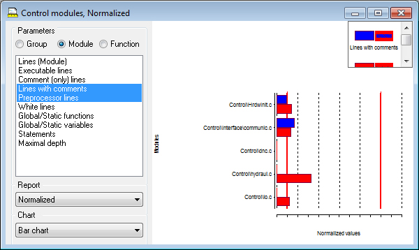
Normalized (Cross Parameter Report)
You can use Cross parameter reports to view the values of several metrics for a group of objects of observation. This type of report, just like the Simple report type, aims to display the real values of metrics, but has the additional possibility of displaying simultaneously several different metrics. In other words, you get several Simple reports in one and the same chart.
For each metrics parameter selected, a data series with as many values as there are selected objects of observation (functions, modules) is formed.
Parameters expressed in percentages (Executable lines, Preprocessor statements...) are obtained by dividing the real values by the number of lines of code or by the number of statements in the code.
In order to display several disparate metrics in the same chart, the values obtained must be normalized, considering specified border values (set in the Options > Software Metrics Analyzer dialog box). Values below 10% point to the parameter value having exceeded the minimal specified value, while values over 100% point to the parameter having exceeded the maximal specified value. Unacceptable values (those which exceed the minimal/maximal specified value) can be visually separated from the acceptable values.
For the level of observation of a group of modules, parameters are obtained as totals of parameter values in modules; these totals are then normalized in the 10-100% interval.
The types of charts which can be applied to Cross parameter reports are Bar, Column, Radar, and Table.
Figure bellow shows a Radar chart for four different parameters with several series, one for each of the functions observed.
Cross parameter report
Distributed
You can use Distribution reports to view the distribution of the values of a single metrics parameter within the specified scope of values.
This type of report can only be created for a single selected parameter. As a result, these reports have a single data series. The values of the selected metrics parameter for each of the objects of observation will be sorted by intervals. The scope of acceptable values is set in the Options > Software Metrics Analyzer dialog box. A scope set in this manner will be divided into five equal intervals, plus an additional interval for those parameter values which are instances of overflow or underflow of acceptable parameter values.
For each of the intervals, the number of times a value of the specified parameter appears in the specified interval in the object of observation is displayed. The number of appearances is expressed in percentages in relation to the total number of appearances. Intervals within the acceptable scope of parameter values differ visually from intervals outside that scope.
Figure bellow shows a report of the Distribution type, in the form of a Pie chart. For example, the parameter viewed is the parameter McCabe Cyclomatic complexity for which the specified scope of acceptable values ranged from 0 to 10. Displayed are the intervals for values ranging from 0 to 2, from 2 to 4, from 6 to 8, from 8 to 10, and for values exceeding 10. The selected object of observation is a group of 12 functions, of which 2 functions have parameter values ranging from 2 to 4. For this interval, 16.7% is displayed (2/12).
The types of charts which can be applied to a Distribution report are Bar, Column, Pie and Table.
Distribution report
Averages
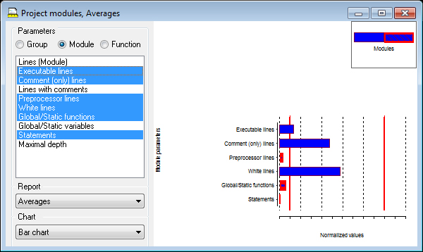
Average reports give you the mean values of one or more metrics over a group of selected objects of observation.
If several parameters have been selected to be displayed, the obtained mean values will be normalized to allow for parallel viewing. In this way, apart from a simple view of mean values for a specified parameter, you can view the comparative relations of metrics (for example, the mean value of the number of clean comment lines in relation to the mean value of the number of lines with comment).
Parameter values are obtained by totaling individual parameter values for each of the objects of observation. Parameters expressed in percentages (Executable lines, Preprocessor statements...) are obtained by dividing these totals by the total number of lines of code or the total number of statements in the code. Values thus obtained are normalized, considering specified border values (set in the Options > Software Metrics Analyzer dialog box).
Values below 10% point to the parameter value having exceeded the minimal specified value, while values over 100% point to the parameter having exceeded the maximal specified value. Unacceptable values (those which exceed the minimal/maximal specified value) can be visually separated from the acceptable values.
The types of charts which can be applied to Average reports are Bar, Column, Radar, and Table.
Figure bellow shows an Average report, shown in the form of a Column chart.
Average report


Types of Metrics Reports by Presentation
The following sections give a detailed description of individual ways of visualizing metrics reports.
Bar Chart
Column Chart
Pie Chart
Radar Chart
Table
Bar ChartA bar chart is made up of a series of horizontal rectangles. Each data series is marked in a different color, and it is possible to choose between seven different styles for viewing. A legend with a brief explanation of each series can be displayed in the report. The report can be sorted according to a series or according to the names of the objects of observation.
It is possible to display any type of metrics report by means of a Bar chart.
Figure bellow displays a Cross parameter metrics report in the form of a Bar chart with five series.
Bar chart
Column Chart
A Column chart is made up of a series of vertical rectangles. Its other attributes are identical to those of a Bar chart.
Each data series is marked by a different color, and it is possible to choose between seven different styles for viewing. A legend with a brief explanation of each series can be displayed in the report. The report can be sorted according to a series or according to the names of the objects of observation.
It is possible to display any type of metrics report by means of a Column chart.
Figure bellow shows a Simple metrics report in the form of a Column chart, with a single series and a large amount of data, displayed in its entirety in the Metrics window by means of the Fit to Window option.
Column chart
Pie Chart
A Pie chart appears as a number of circular segments, each of which represents an interval of the parameter value. A single series is allowed, and there are two colors for viewing, representing values in the acceptable and unacceptable scope, to choose from.
A Pie chart can be selected only for Distribution metrics reports.
Figure bellow shows a Pie chart with values in the unacceptable scope marked red.
Pie chart
Radar Chart
A Radar chart appears as a group of dots on the radial axes and lines which connect values in the same series. Each series is represented by a broken line in one of the seven possible styles. A legend with a brief explanation of each series can be displayed in the report.
A Radar chart can be selected for Cross parameter and Average metrics reports.
Figure bellow shows a Cross parameter metrics report in the form of a Radar chart with five parameters displayed for several functions viewed.
Radar chart
Table
Table view is a table which displays the values of a single or multiple data series in a column. Acceptable and unacceptable property values are displayed in different colors. A table can be sorted according to data by clicking the column header. The visibility of values in the table can be improved by selecting the Grid and Stripes options. A table is the only view which has the possibility of displaying the decimal part of property values. The other types of charts display rounded off parameter values. Values can be displayed with an accuracy of six decimal places.
Figure bellow shows a Cross parameter report in the form of a table (in Construction Mode) with nine modules viewed.


Working with Metrics Reports
This chapter describes the details of working with metrics reports and actions frequently performed upon them.
Selecting Objects
You can select certain parts of a metrics report by clicking. After a selection has been made, the specified object is drawn in a different color and its edges become thicker. The selection can be cancelled by clicking another object, or the empty space of the metrics report.
Selecting certain values of a data series allows you to sort the metrics report according to the data in that series. Selecting names of modules or of functions allows you to sort the report according to names, or to select a new object of observation for metrics reports.
Using the Shortcut Menu
Right-clicking one of the values displayed in a metrics report opens the shortcut menu. Depending on the selected level of observation for the metrics report, the contents of the shortcut menu will be as follows:
Level of Observation for a Group of Modules
The shortcut menu displays the names of the modules selected in the object of observation. Clicking one of the names opens an Editor with the selected module.
Level of Observation for a Single Module
For Simple and Cross Parameter reports, the shortcut menu displays all the functions of the selected module. For Distribution reports, the shortcut menu displays all modules whose parameter values are within the specified scope. For Average reports, the shortcut menu displays all modules selected in the object of observation. Clicking one of the names opens an Editor with the selected module or function.
Function Level of Observation
For Simple and Cross parameter reports, the shortcut menu is identical to that in the Editor and pertains to the function selected. Choosing a command from the menu opens the corresponding window (Editor, Browser, Graph, or the Metrics window) which displays the content you wanted.
For Distribution reports, the shortcut menu displays all functions whose parameter values are within the specified scope. For Average reports, the shortcut menu displays all functions selected in the object of observation. Clicking one of the names opens an Editor with the selected function.
Tooltips
When you hold the insertion point over a parameter value displayed in a chart, a tooltip appears, displaying the series to which the value belongs (if there are several series), and the rounded off numerical value. A more exact value (rounded off to the number of decimal places you have specified) can be viewed in Table chart.
Closing the Metrics Report
Once created, a metrics report is considered a part of the active metrics template and can be completely removed only by means of the Metrics > Remove report command. Closing the Metrics Report window in some other way only removes the metrics report from the desktop area. A temporarily removed metrics report can be displayed again by selecting it from the LRU list of the Metrics menu.
Copying the Metrics Report to the Clipboard
You can copy an active metrics report to the Clipboard by means of the Edit > Copy command. The report will be copied in WMF (Windows Metafile Format) for Bar, Column, Radar, and Pie chart types of view. For Table view, RTF (Rich Text Format) will be used.
Thanks to this possibility, metrics reports can be worked on in graphics programs or spreadsheet programs.
Saving the Metrics Report
You can save an active metrics report by means of the File > Save As command. The Save As dialog box will appear with a suggestion for naming the file in which the report will be saved. Reports of the Bar, Column, Radar, and Pie type are saved in WMF format. Data from Table view can be saved either in RTF or TXT format; the latter will be in tab-delimited form.
The suggested file name is identical to the title of the window of the metrics report you want to save, with the addition of the appropriate extension.
Printing the Metrics Report
You can print a metrics report by means of the File > Print command. Before doing this you can take a look at the preview of the metrics report by means of the File > Print Preview command.
As with the other windows in DA-C, you can choose between mosaic and fit-to-page printing.
The dimensions of the printed metrics reports can be set in the Metrics > Options dialog box. In this dialog box, report dimensions can be set in physical units (inches, millimeters), so that printing is guaranteed to be consistent with the specified dimensions. The metrics report appears proportionally scaled on the screen considering the specified report dimensions.
A legend containing precise explanations of particular data series can appear on the printed metrics report.